What can we learn from Burger King, GM, and Google?
It seems like every big company is rebranding these days. (Maybe it’s because 2020 made us all feel like we needed a little breath of fresh air.) As is always the case with huge rebrands, some are met with approval and others with disdain. The court of public opinion on a beloved company’s identity can get intense. However, there’s always some new insight we can glean about consumer trends and business practices. Here are four major rebrands from recent weeks and what we can learn from them.
Burger King Goes Retro (To Great Applause)
Burger King just rolled out a brand that’s so old, it’s new. They’ve ditched the “shiny burger” icon that’s been gracing drive throughs and paper bags for 20 years in favor of a 2D, curvy, earth-toned look that feels sort of groovy. And their rebrand is more than a logo–everything from typefaces to photography to uniforms is getting an overhaul. This comes right in step with a company initiative to embrace real, quality ingredients.
In the words of Jones Knowles Ritchie, the agency behind the new identity:
For Burger King’s first global rebrand in more than two decades, we set out to make the brand feel less synthetic and artificial, and more real, crave-able and tasty. We were inspired by the brand’s original logo and how it has grown to have an iconic place in culture. The new logo pays homage to the brand’s heritage with a refined design that’s confident, simple and fun.
The rebrand has been met with nearly unanimous praise from designers and fast food enthusiasts alike. So what did BK do right? Let’s look at the takeaways.
- A long-standing brand can evoke a sense of nostalgia (if that resonates with customers)
- Tying a rebrand to overall company goals and initiatives is a must
- Branding is so much more than just a logo
- A great rebrand doesn’t have to be flashy or complicated
GM’s Logo Is Less Electric Than It Thought
General Motors also launched a new logo in early January 2021. Like Burger King, their new look was tied in with company initiatives. In this case, GM is pushing its “everybody in” electric vehicle and sustainability campaign. The new logo reverses out the blue/white coloring and drops the longtime capital initials in favor of a modern, lowercase typeface. The logo won’t be used on any cars, but is being used on GM’s digital assets and some marketing campaigns.
According to GM’s designers, the idea is that the light background evokes “the clean skies of a zero-emissions future” and that the negative space of the “m” looks like an electric plug. (Personally, we don’t see it, and that has been a common criticism.)
Response to the new logo has been lukewarm at best. We wouldn’t call it an outright disaster, but there are certainly some lessons to learn here.
- Say it with us: branding is more than just a logo
- If the design needs to be explained, it’s not obvious enough
- Rebranding in step with a company initiatives is smart, but make sure it’s a long-term initiative
- If you have a new identity, use it!
- Your audience might prefer the tried-and-true look
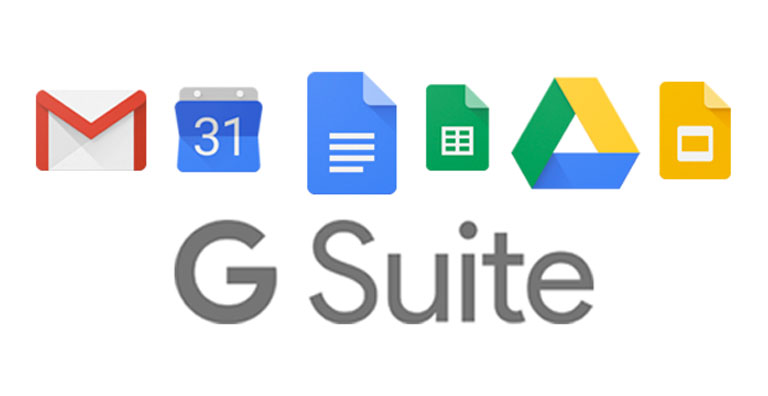
Google Workspace Icons Choose Form Over Function
Google always takes a lot of heat when they change the look of one of their products. Not surprising, considering that they own some of the most recognizable brands in the world. The latest redesign is their G Suite, now called Google Workspace, including tools like Gmail and Google Calendar. The new look unifies the color schemes and dimensions of tool icons in a more representational, abstract design.
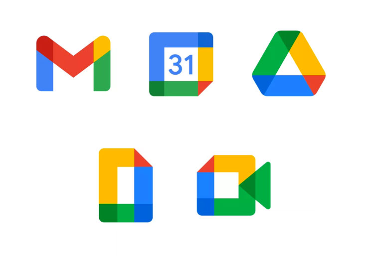
Visually, there’s a lot to love about the new design. They’re clean and simple, and they all relate back to the main Google logo. However, are they serving the intended purpose? This viral meme might state the problem most succinctly:
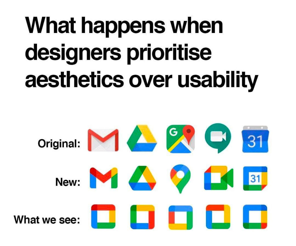
The new icons are pretty, but Google sacrificed the user experience in the progress. And when you’re a tech company like Google, user experience is everything. It’s telling that some of the top search results related to the rebrand (on Google, no less!) are for browser extensions and workarounds to restore the old, well-loved icons.
So, what can we learn from Google?
- Branding can help unify products, acquisitions, or sub-brands that have appeared over time
- If you have a well-known brand, take advantage of that when expanding your offerings
- A consistent look and feel is what makes you identifiable
- A design can go too far by prioritizing looks over function
- Test, test, test to make sure the branding has the intended effect
Whose Opinion Matters, Anyway?
There will always be people who rave about a rebrand, just like there will always be people who can’t stand it. It’s the old “you can’t please everyone” problem. So whose opinion matters the most?
Since we’re a creative agency, you might expect us to say that the designers should have the final say–after all, we’re educated and experienced experts. While that’s true, we’re just here to take the brand and ideas you’ve already harnessed and translate these as a visual identity. The next logical step is to assume that your opinion is what counts, since it’s your business and your brand. While that’s true, and you do control how your brand presents itself to the world, there’s one opinion that matters even more.
Your audience.
These are the people that you serve or that you want to serve. If your brand identity doesn’t resonate with them and serve their needs, it’s not doing its job. When in doubt, circle back and think about your ideal customer and how he or she would react to your logo, color schemes, artwork, and more. If it’s not the reaction you want, it’s time to go back to the drawing board and try again.
If it’s time for a refresh, let’s grab (virtual) coffee and get started with your (audience-centric!) rebrand.